 Domain RegistrationFind and register the perfect domain for your website.
 .COM DomainChoose a widely recognized domain to build global credibility.
 Domain TransferSeamless domain transfers with zero downtime and complete control.
 All TLDsFind and register your perfect domain. Choose from local and global extensions.
 SSL CertificatesKeep your website safe with reliable SSL Certificates that protect customer data and build trust.
 whoisCheck domain ownership details, expiration dates, and registrar information.
 US DomainRegister a .US domain and build trust in the USA.
 Web HostingEverything your website needs to run smoothly
 WordPress HostingWordPress hosting that just works
 Windows HostingReliable hosting for Windows environments
 Reseller HostingTurn hosting into your business
 Email HostingEmail that looks professional and works anywhere
 cPanel HostingFull control of your hosting with cPanel
 Affiliate ProgramJoin as a partner and earn commissions on every referral you send our way.
 Vps HostingScalable virtual servers that expand as you need.
 Dedicated ServersGet complete access and full control over your dedicated physical server.
 Managed vpsNot tech-savvy? We will take care of everything with our fully managed VPS hosting for you.
 AI Website BuilderCreate stunning websites in seconds with AI.
 Online ShopSet up a professional online store. No coding required.
 Web design serviceGet a tailored website designed to match your brand and support your goals.
 BlogFind helpful guides on web hosting, online selling, digital marketing, and more.
 Contact USYou can reach us anytime, day or night, through chat or email.
 SupportBrowse helpful guides and answers for all of our services.
Updating WordPress and redesigning your website are two different jobs.
WordPress Version 7.1 makes the second job more appealing: you can refine phone layouts, build tabbed sections and work with new media tools.
But changing everything during an upgrade makes it harder to identify the cause if a page stops working.
I would approach this release in two passes. First, establish that your existing website works on the updated software.
Then choose the design or publishing improvements that solve a real problem on your site.
WordPress released 7.1, “Mary Lou,” on August 19, 2026. The About screen below identifies the version in the test environment. I used the test environment as this is a standard practice when testing new major updates.

The examples from this article come from a Playground session using Twenty Twenty-Five Official WordPress Theme.
I verified saved text settings, tab content and preview interactions there.
Official documentation supplies the capabilities beyond those completed checks. A useful adoption plan combines that evidence with the pages, plugins and publishing work your own website depends on.
Give the upgrade a clear boundary
Start with a working copy of the current site (try staging environment), and a recovery method you understand.
WordPress’s update guidance recommends a backup before changing the installation.
Our restoration guide explains the recovery options if you need to establish that method first.
Next, create a separate place to assess the release. Our cPanel staging guide covers automated and manual routes, depending on the tools your account includes.
A useful baseline is deliberately ordinary: your existing homepage, a page with a form, an article and any revenue-critical journey.
Record what they do before the upgrade. Afterward, repeat those same actions before introducing new blocks or restyling the site.
This separation helps with diagnosis. If a contact form fails immediately after the version change, you have a narrower investigation than if you also changed its plugin, page layout and submission button that morning.
Once the baseline works, choose where the next change belongs:
What needs attention? | Where the work belongs | What would establish success? |
|---|---|---|
One page has a cramped introduction | That page’s block settings | The phone layout improves without disturbing other pages |
Repeated buttons need consistent styling | Shared styles for the relevant block type | Representative pages use the intended treatment |
Visitors struggle to scan supporting content | The page’s information structure | Labels and content remain understandable in the preview |
A custom editing tool behaves differently | The theme or plugin integration | The editor can change and retain the intended content |
This is a scope decision, not a requirement to use every new feature.
A site with a clear, readable layout may need only the software update and compatibility checks.
1) Organize the editing work before changing the design (Notes Upgrade)
For a small team, a website refresh often moves through several hands: someone revises the wording, someone checks the offer, and someone applies the design.
WordPress 7.1 gives those people better places to leave feedback and move around the editing workspace.
Notes now support richer formatting, links, mentions and feedback attached to selected text.
The official example shows how a comment can address a collaborator directly.

Use a note to name the decision the next person must make. “Confirm whether this service includes weekend appointments” gives an editor a concrete question; “improve this section” leaves them guessing.
Keep unresolved offer details separate from choices about spacing or color so a visual edit does not accidentally settle a business question.
These feedback tools do not turn the release into a simultaneous multi-author editor.
WordPress left real-time collaborative editing out of the final 7.1 scope. This should be comming in the next versions.
Until then, plan an editing handoff when several people need to change the same document.
2) Move from a page problem to the right workspace
The persistent admin toolbar now remains accessible during editing.
That reduces the need to leave your current work just to find another part of WordPress as it has always been the case.

In the test, searching for “styles” through the command palette (Ctrl + K) produced a route to the site-wide styling area.

Selecting that result opened the Site Editor controls shown here.
The useful distinction is the scope of the destination: a shared design change deserves a review across several pages, while a one-off content problem may belong entirely inside the original draft.

For example, if only the introduction to one service page feels oversized on a phone, start with that paragraph.
If every service page has the same problem, investigate the shared styling rule before adding a separate exception to each page.
3) Fix a specific phone-layout problem
Responsive controls are most useful when you can name the defect:
a heading consumes too much screen space,
a row becomes crowded or
a section padding overwhelms the content.
Begin with the affected block instead of reducing text everywhere because a responsive option now exists.
The View menu exposes the device choices and the Responsive styles switch.
Those controls let you inspect a smaller canvas and work with styles for that range.

To test this, I used a paragraph’s Small font-size option to make the mobile setting easy to distinguish.
The selection remained after saving and returning to the draft.

The desktop inspector did not show the same selection. So the change above only affected the mobile version.
That comparison establishes a scoped change; it does not establish that Small is the best reading size for your visitors.

Check the boundary as well as the device preview
WordPress treats the desktop styling as the base, with mobile and tablet rules overriding supported properties within their ranges.
Its default boundaries put Mobile at 480px and below, with Tablet above 480px through 782px.
Themes can change those boundaries through settings.viewport.

A layout can look comfortable at a narrow phone width yet become awkward just before a breakpoint.
For a long service title, inspect where the final word wraps and whether the next paragraph still has a clear starting point.
The boundary is a useful place to look for abrupt changes in rhythm.
The complete mobile canvas adds another perspective: it shows how the introduction and tabbed content fit together.
A correct inspector value is only part of the result; the page still needs a readable sequence.
Make interaction states recognizable
Buttons and Navigation Links also gain interactive style controls for Hover, Focus, Focus-visible and Active states.
The official menu illustrates these options.

Treat these as communication cues.
A pointer hover can show that a control responds to the mouse; a visible keyboard focus treatment tells someone where their next action will land.
Choose a treatment that remains noticeable against the surrounding section, including when the button already uses your strongest brand color.
Review several real placements before adopting a shared button rule. A border that stands out on a white content area may disappear against a dark footer.
The release supplies the controls; the surrounding design determines whether a visitor can perceive the result.
4) Decide what deserves a tab
The Tabs block changes how you organize information, not just how much of it appears at once.
It works best when visitors can predict the content from the labels and do not need to see every panel together.
For the test page, Services held the introductory offer. Its panel remained separate from the support information.

Support contained a different paragraph about maintaining the website. Switching the active tab in the editor displayed that paragraph instead of the offer.

For your own page, ask whether a visitor needs comparison or separation.
Related help topics can work as separate panels. Two plans whose differences determine a purchase may be easier to assess side by side.
Tabs would save vertical space in both cases, but only the first necessarily benefits from hiding the sibling content.
Review content and keyboard operation separately
After saving and reopening, the test retained both panel labels and their content.
The front-end preview also displayed the Support paragraph when that tab was active.

The keyboard check then moved focus left from Support to Services. Pressing Enter displayed Services.
That matters because reaching a control and activating it are different parts of the interaction.

Check both aspects on your page: does each label lead to the expected material, and can a keyboard user reach and open it?
Also review the first panel on arrival. Essential contact information should not become difficult to find because the page initially opens a different topic.
5) Match media tools to the publishing job
A photo edit, an image upload and an audio collection can all begin in the media workflow, but each has a different success condition.
Keeping those conditions separate helps you assess the new tools without assuming that one successful action proves the whole workflow.
Prepare a photo for its actual placement
The image editor brings crop, orientation and metadata controls into a dedicated modal.
WordPress’s illustration shows the available crop tools.

For a team portrait, the important question is whether the intended faces remain visible in the page’s image area.
For a product photograph, it might be whether the crop preserves the edge or detail a buyer needs.
Inspect the image in its destination block, since the editing canvas cannot tell you whether the final composition serves that page.
Upload processing is a separate consideration.
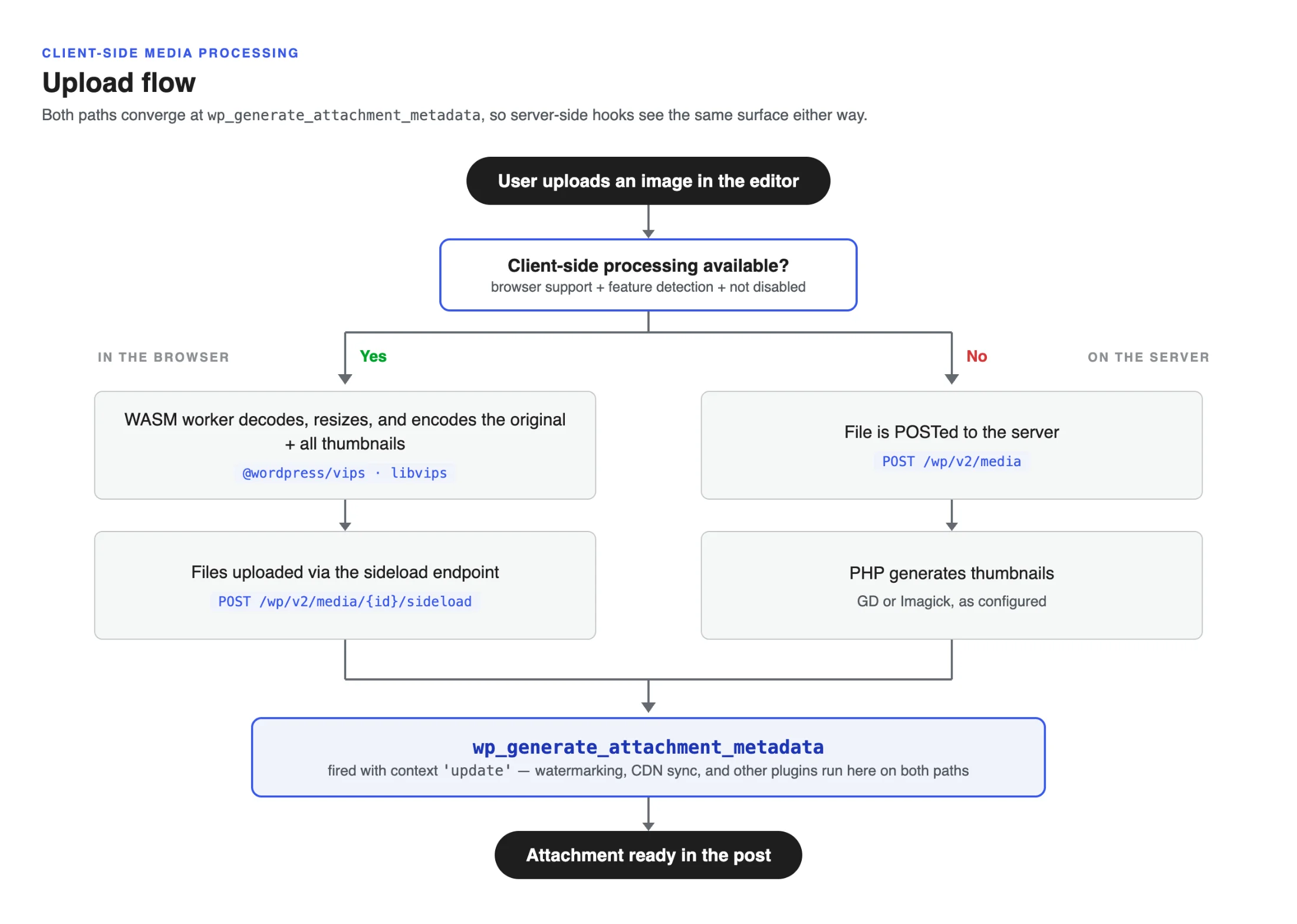
On compatible browsers and devices, WordPress can prepare image sizes in the browser through its WebAssembly/libvips pipeline.
Unsupported setups use server processing instead. HEIC decoding also depends on platform support.
Supports these formats: (JPEG, PNG, WebP, AVIF, GIF)

Choose test files from your real publishing work: a phone photo, a wide banner or an image with fine detail.
Confirm that the upload completes, the library entry is usable and the placed image has the expected appearance. This gives you a practical check of the formats and compositions your editors actually need.
Browser preparation can reduce server image-processing work, but sending the generated sizes can increase upload traffic.
I would not promise a faster upload on that basis, and this session did not benchmark either speed or resource usage.
6) Give an audio collection a listening purpose
Playlist provides a block for multiple tracks. The local test reached the empty block and its Upload and Media Library entry points.


The official player example includes an optional waveform. I did not verify audio playback during the sandbox session.

Before building a collection, decide whether listeners should follow a sequence or choose individual samples.
A short training series needs an obvious order; a musician’s demos need recognizable track names.
For either case, assess the actual files, labels and controls together.
7) Reserve integration changes for the developer review
Some 7.1 additions expand what developers can build rather than supplying a new task for every site owner.
The SVG Icon API is one example: it provides a shared route for registering and rendering icons.
The official artwork suggests the range of visual treatments an integration might use.

An icon collection is useful when it clarifies a real content or interface need. It does not justify replacing familiar labels with unexplained symbols.
If you commission custom block work, include the meaning of the icon and its context in the brief, not just its color and shape.
The more immediate compatibility concern is the fully iframed post editor. Version 7.1 applies that editing mode regardless of theme or block API version.
Integrations that assume the main window contains the editor canvas may need changes.
Give the developer an example of the work that must survive: selecting a custom block, changing one of its controls and retaining that edit.
Include older content as well as a new draft. A page can still display correctly while the tool your team uses to maintain it has a problem.
Review other release APIs only where your extensions use them. This keeps the compatibility conversation tied to your installation rather than turning the entire developer changelog into a to-do list.
8) Move approved changes without replacing newer live data
The final decision concerns what moves back to production.
A staging copy starts from an earlier point in time. Meanwhile, the live website may receive orders, comments, new posts or account changes.
Our staging guide highlights the risk of copying an older database over that newer activity. Decide how to transfer the approved changes before choosing a push or migration method.
A design review should not end by silently discarding the business records created while it was underway.
Keep a current recovery point, move the intended changes using the method appropriate to your setup, and inspect the live result.
Where caching applies, clear it as part of the update process and check what an ordinary visitor receives.
Otherwise, a stale page can hide a successful change or make a corrected issue appear unresolved.
For a small site, the first improvement might be one mobile heading or a better-organized help section. Finish that change, verify its result and let it become the new baseline. You can then judge the next improvement against a known working site.
If you are reviewing the hosting environment alongside this work, explore our WordPress hosting.
Choose the setup that supports how you maintain the site, then keep the release update and optional redesign as deliberate, reviewable changes.